
One of the first things about setting up a medical clinic is about creating a brand for the clinic. Branding will inevitably bring to our mind making a logo for our business.
In fact, this step of the process is so important that you should not neglect or be hasty – because a well-designed clinic logo is one of the best visual assets that you can have to communicate positive brand values to your audience and clients. Even if you are budget-conscious about spending on branding your clinic, consider that a well-designed and professional clinic logo will go a long way in helping you succeed in building your professional image overall as you grow your clinic business.
A superior quality medical clinic logo will help you to build and communicate your values and services, raise your reputation, and enable you to stand out from the competition. Therefore, we have outlined here 8 essential and important tips to guide you through creating a medical logo design.
Table of Contents
Toggle

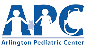
Avoid using too many colours. You should carefully research on the common colours for a clinic logo. Distinctive colours of a clinic logo convey different meanings, mood and feelings about a brand. Adopt at best 2 colours to represent your clinic logo – do not use more than 2 colours, lest your logo ends up looking like an illustration from a story book. The main point is to avoid giving the logo an overwhelming and busy look that can distract instead of giving the right attention. The use of colours for medical logos can be at best up to 3 colours, if you feel it is necessary that it can enhance your brand. Else, the ‘less-is-more’ principle apply.
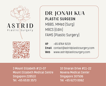
A good clinic logo should apply clearly and easily on print (name cards) both in colour, and in black and white or grey tone. Similarly, the same logo should be well presented on your website and easy to identify on letterheads, business cards, and signages.
Colours that are preferred for medical logos usually include variations of red, blue and green. Shades of blue and white are usually used in the healthcare and medical industry – where these two colours convey serenity, cleanliness, credibility, trust and professionalism. Consider carefully about the colours you want to adopt for your target market. Avoid colours bright or intense that may be too distracting or unprofessional.




There are several types of fonts (text for your medical clinic logo) used on logos. But there are 2 categories that are commonly used for business logos, namely sans serifs (without strokes) and serifs (with strokes). The fonts used for logos should be clear and easy to read. A serif (e.g. Times New Roman) font can give a professional and traditional look, while a sans-serif (e.g. Arial) font can give a modern and clean look. The bottom line is to select a font that is legible, recognizable and appropriate to the value conveyed. Stay away from using overly decorative or ornate fonts that can be difficult to read.




Consider using a symbol or icon that reflects your clinic’s values or services. This can help your logo to stand out and make it more memorable. Incorporating medical symbols such as the caduceus, heart, stethoscope, or cross can help communicate the nature of your business to potential patients clearly. However, it is important to use these symbols in a subtle and tasteful way, without making the logo feel overly cluttered or clichéd.



Create a unique design that sets your clinic apart from others. Steer away from copying or imitating existing logos or designs, as this may lead to copyright issues and at the same time harm your brand reputation. A truly unique logo can help the clinic brand well and increase brand recognition.


Make sure your logo is versatile and scalable, meaning it can be scaled up or down without losing its quality or clarity which is important for creating a logo that can be used in different contexts. This is important for its use on different physical and digital platforms and marketing materials. For example, if it is to be used on a website, consider how it will look on small screens or devices.
Similarly, when considering in terms of versatility, your logo should be able to be utilized across a variety of mediums, from business cards to billboards.
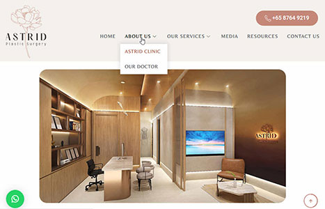
Furthermore, you can have a very good overview of your medical logo if you can test and apply on all marketing collaterals first. For example, layout your logo on name cards, posters and company signages will help you greatly to understand how the logo will look and the differences on small and large prints. Equally, it works the same when comes to putting your medical clinic logo on your website and mobile.

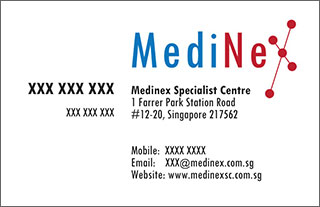


Ensure that your logo design looks professional and polished. If you have a budget, it always make good business sense to hire a professional graphic designer to create your logo, especially if you do not have design skills or experience. Trying to save costs by designing logos on your own may not always be effective because the result may become unprofessional for your clinic’s use, which does not go well with your branding in the long run.


Before finalizing the logo, it is vital to gather feedback from healthcare professionals, friends and other stakeholders. This feedback can help improve the logo and ensure that it invokes the right responses from the target audience. Test your logo with different audiences and get feedback. Make revisions based on feedback to ensure that your logo is well-received and effectively communicates your brand identity.
By now, you would have discovered the true value of a good and professional logo. A well-designed clinic logo is distinctive, appropriate, practical, simple in form, and conveys the owner’s intended meaning or message.
If you can adhere to and execute these suggested tips, you should be able to make a logo that effectively communicates your clinic’s values and services, while also standing out from the competition.
Designing the right clinic logo can sometimes be overwhelming. The technicalities of designing and applying the logo on different applications can often be daunting. Medinex Specialist Centre specializes in medical support professional services such as medical clinic setups, which include logo design, marketing collaterals, web site design and digital marketing for medical clinics.
If you like to speak to a clinic design professional to outsource your logo design and branding work, please do not hesitate to call us at +65 8023 9505 or simply contact us at [email protected]
1 Farrer Park Station Road, #12-20, CONNEXION, Singapore 217562, Tel: +65 8023 9505 Email: [email protected]
1 Farrer Park Station Road, #12-20
CONNEXION, Singapore 217562
© 2025 Medinex Specialist Centre